 Despite Changes, There's Little to Love in 2012 Olympics Logo
 Published: March 28, 2010
LONDON — Call me a softie, but whenever I used to spot one of those lovely old UPS trucks whizzing by on the street, I’d swoon. They were gorgeous. Great shape. Great colors. Great logo.
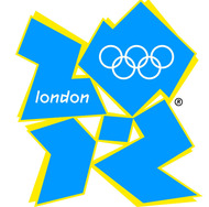
The London 2012 Olympics logo.
That logo dated back to 1961 when the great American graphic designer, Paul Rand, drew it as a parcel topping a simple shield framing the letters u, p and s. Seven years ago, it “retired” when UPS replaced it with a new one. It isn’t the worst logo I’ve seen (tragically there’s tough competition for that slot) but it’s so bland that one blogger dubbed it the “golden combover.” Every other element of UPS’s visual identity became blander too, so much so that I winced when I first saw the new trucks.
If only I was still wincing, because these days I fume. Another symbol has been added alongside the “golden combover” to UPS’s (no longer quite so) new British trucks — a sponsor’s logo for the London 2012 Olympic Games.
It isn’t unusual for design nuts like me to seethe whenever a dodgy new design appears, or a great one disappears. But it’s very rare for “civilians” — as designers call almost everyone else — to do so too. The London 2012 logo caused such a storm at its launch in 2007, that it became an exception.
Garish colors, aggressive shapes and dodgy typography were just a few of its design crimes. Some thought it looked like a swastika. Others spotted Lisa Simpson doing something unmentionable. The animated version caused seizures among some people with a particular type of epilepsy. Fly posters appeared across East London featuring an unofficial version of the logo in which the numbers 2, 0, 1 and 2 were replaced by the letters of an off-color word.
The London 2012 organizers and their designers, Wolff Olins, responded by claiming that the logo was intentionally brave, bold and ahead of its time but that we would learn to love it. That was nearly three years ago, plenty of time to win us over. Were they right?
There was every chance that they would be. Tastes do change, often because it takes time to appreciate the subtleties of something that, like the 2012 logo, seems odd at first sight. Take Google’s logo. I used to loathe its happy-clappy gaucheness, but now I quite like it, despite knowing that there’s nothing gauche about its indomitable owner. Also the British love to mock ambitious, expensive flops, only to fall for them once there’s a hint of redemption. Think of the London Eye and Millennium Bridge. Once pilloried as technical debacles, they’re now popular London landmarks.
Plus, it’s in everyone’s interest for London 2012 to have a great logo. (It’s not just Londoners, like me, who’ll find it impossible to ignore.) Some people disagree. They argue that design doesn’t matter to this or any other Olympics, because the only thing that does is sport. They’re wrong. Of course, sport is the most important element, but not to the exclusion of everything else.
Firstly, what’s the point of designing anything that isn’t as good as it can possibly be, especially if it will: a) be as visible as an Olympic logo; and b) cost a fortune to commission, develop and execute? A well-designed logo isn’t necessarily more expensive than a bad one, and promises to “earn” much more over the years, in this case by selling more London 2012 souvenirs, and persuading more people to visit the city, or do business there.
Secondly, this is London, which boasts a great graphic design heritage: from 18th-century typeface designers like William Caslon to contemporary figures such as Peter Saville and Graphic Thought Facility. Blessed with so much talent, London has no excuse not to produce vintage Olympic graphics for 2012 like Lance Wyman’s for the Mexico City Games in 1968 and (my favorite) Otl Aicher’s for the Munich Olympics in 1972.
Will it? I wish I could say that the London 2012 logo has grown on me, as the organizers predicted, but it hasn’t. Everyone else I’ve asked feels the same — designers and “civilians” alike. Far from being “ahead of its time,” it looks increasingly like the graphic equivalent of what we Brits scathingly call “dad dancing,” namely a middle-aged man who tries so hard to be cool on the dance floor that he fails.
There has been some progress. The customized logo that celebrated the 2008 handing over of the Games from Beijing to London benefited from replacing the garish colors of the original with the Union Jack flag. Better still is the logo for the education program, which was unveiled last fall as the winner of a student design competition. As well as adding cheerfully colored pencils in place of the garish shades, Reiss Evans, the winning student, cleaned up the shape by erasing the messy “shadows” around the numbers in the original.
The London 2012 organizers say that they always intended Wolff Olins’s design to “evolve over time.” Any future changes will be the responsibility of the McCann Group, which was appointed last year to handle all of 2012’s marketing, including design. Whether design should be entrusted to a corporate marketing machine like McCann or bundled into marketing at all is debatable. Though I bet the outcome would be better if it was not. That said, the education logo was selected under McCann’s watch, and it is an improvement.
But that isn’t enough for something so important. The London 2012 organizers have already squandered their opportunity to commission great architecture by replacing some of the original designs, except Zaha Hadid’s aquatic center, with inferior ones. It’s too late to redress that, just as it’s too late to do what they should have done three years ago and commission a new logo, not least as 2012’s sponsors like UPS have now adopted the original. But it isn’t too late to make the design much, much better, and they could start by dumping that dodgy typeface.
 Despite Changes, There's Little to Love in 2012 Olympics Logo